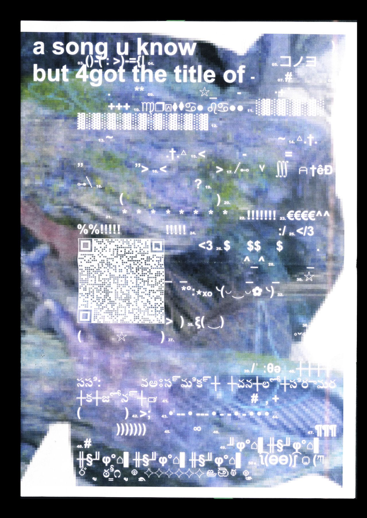
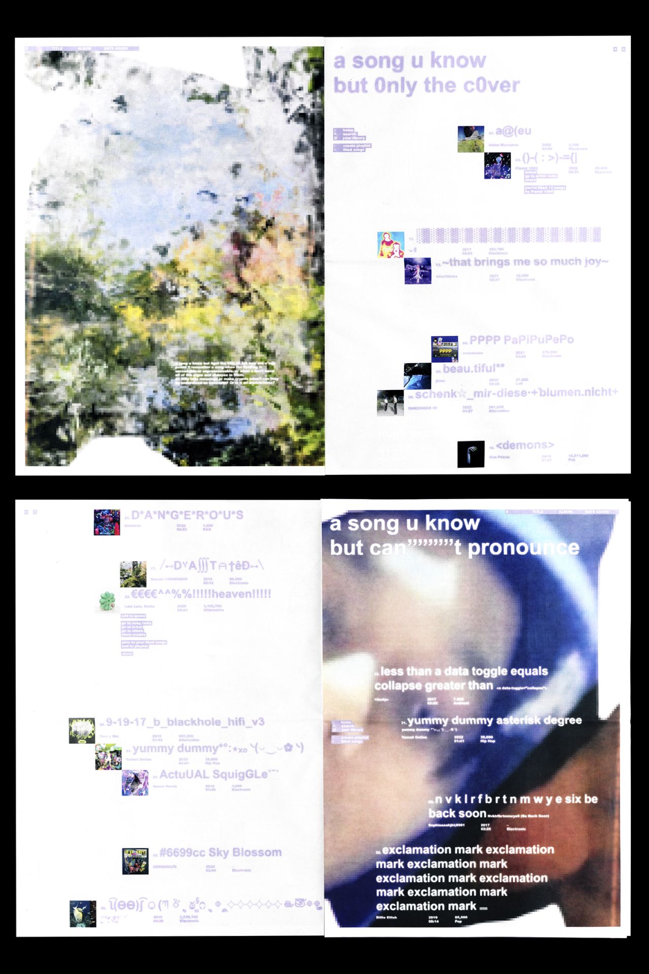
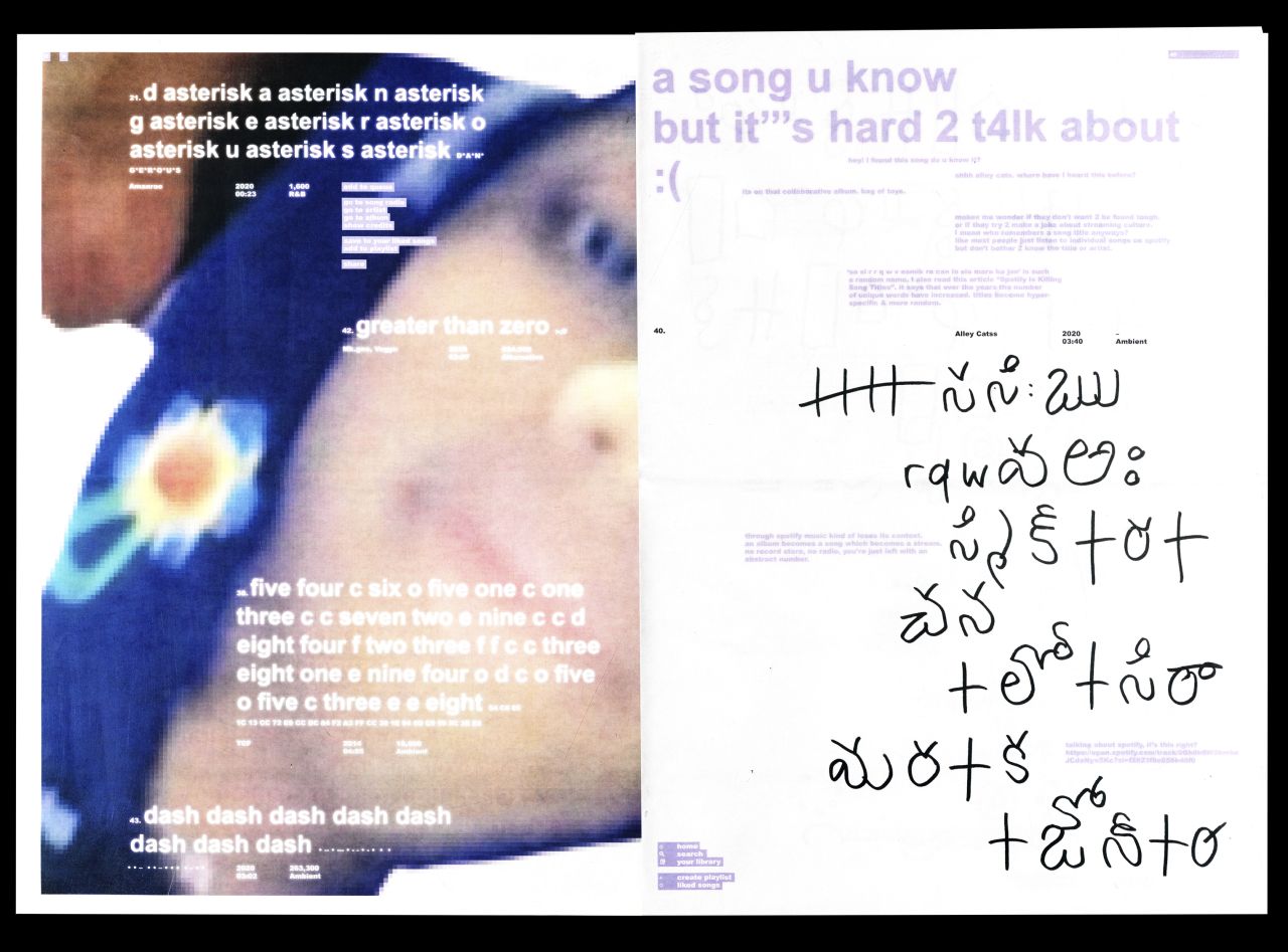
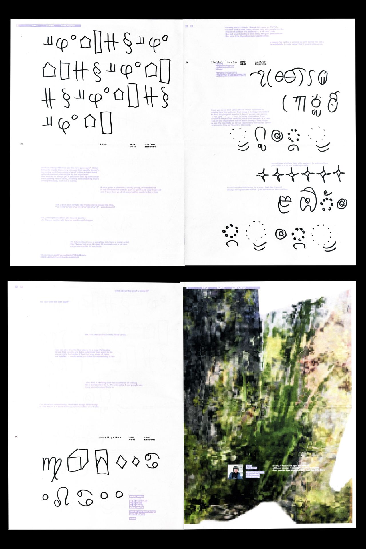
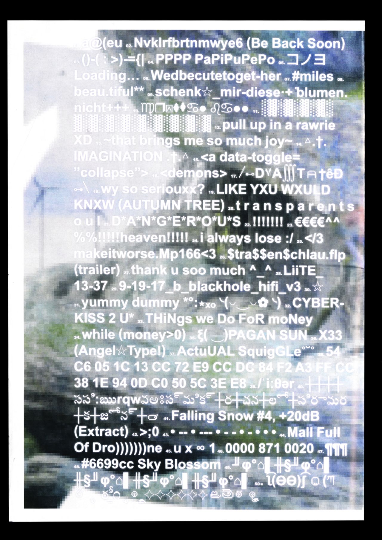
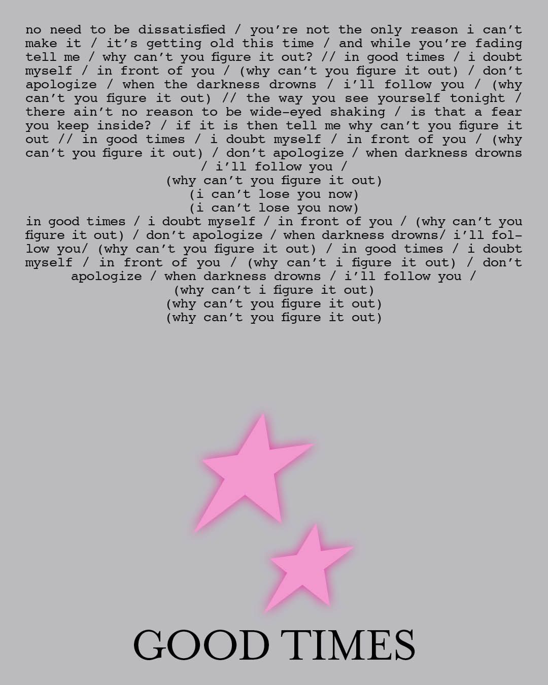
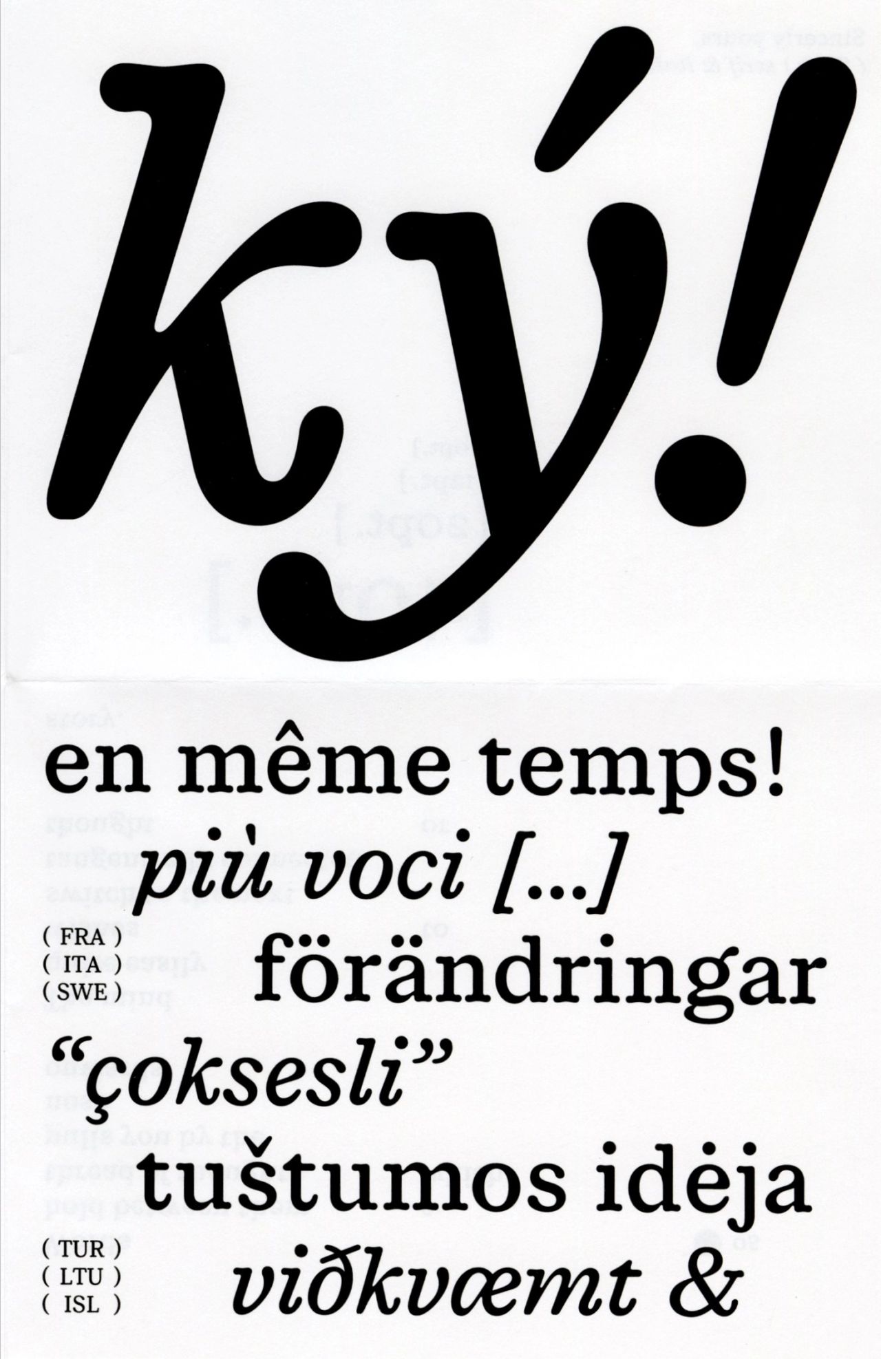
A SONG U KNOW BUT 4GOT THE TITLE OF showcases 50 song titles that reflect a shift in their spelling and phrasing, making them unreadable, untypeable, and unpronounceable. Examined in the context of streaming culture and social media, these titles raise questions about memory, hidden meanings, and how we form connections with songs, challenging the ways we recognize, recall, and interpret music in the digital age. The accompanying essay situates this project within online music culture, from viral TikTok trends to algorithmic influence, playful spelling, and meme-driven promotion.
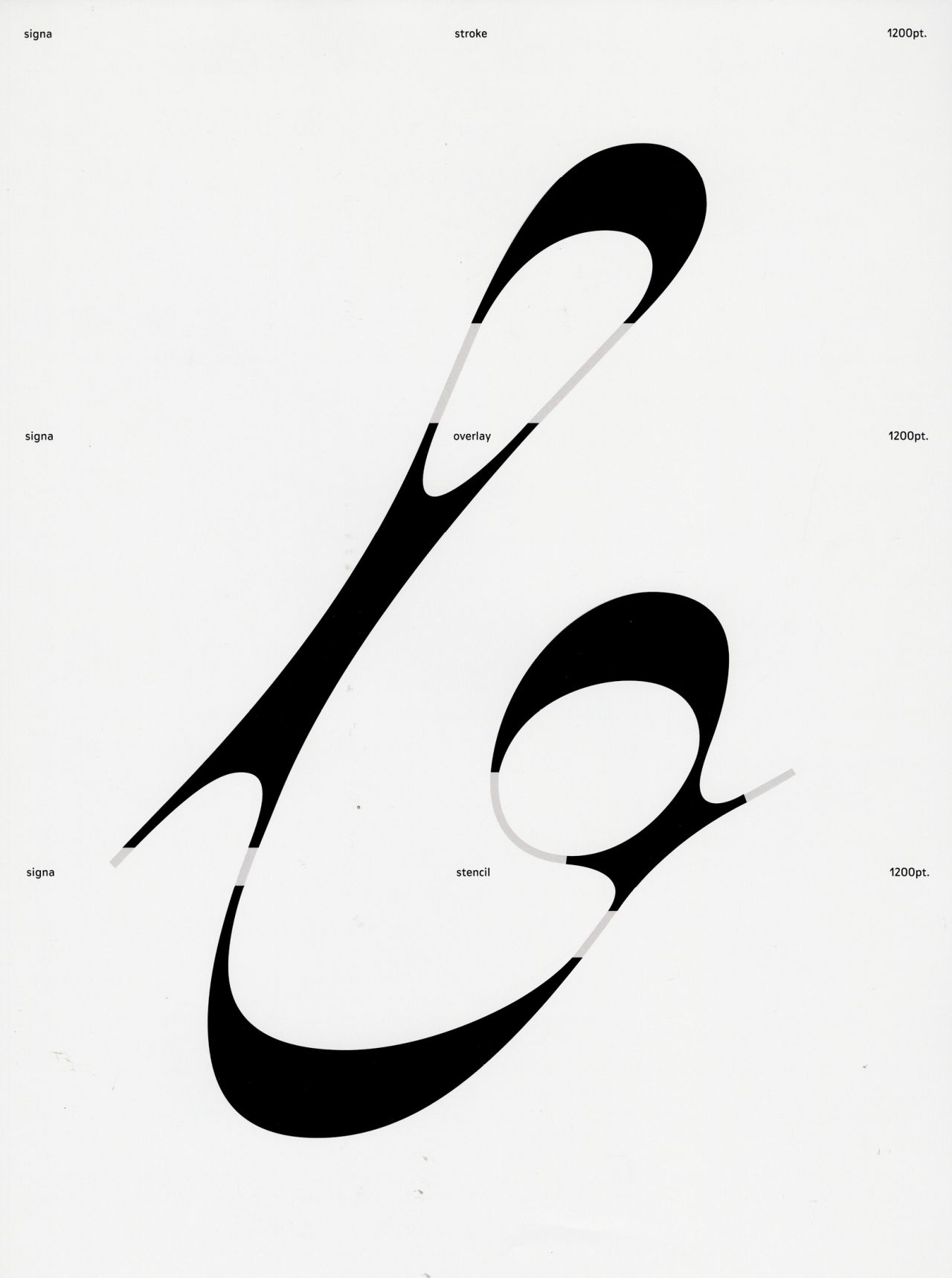
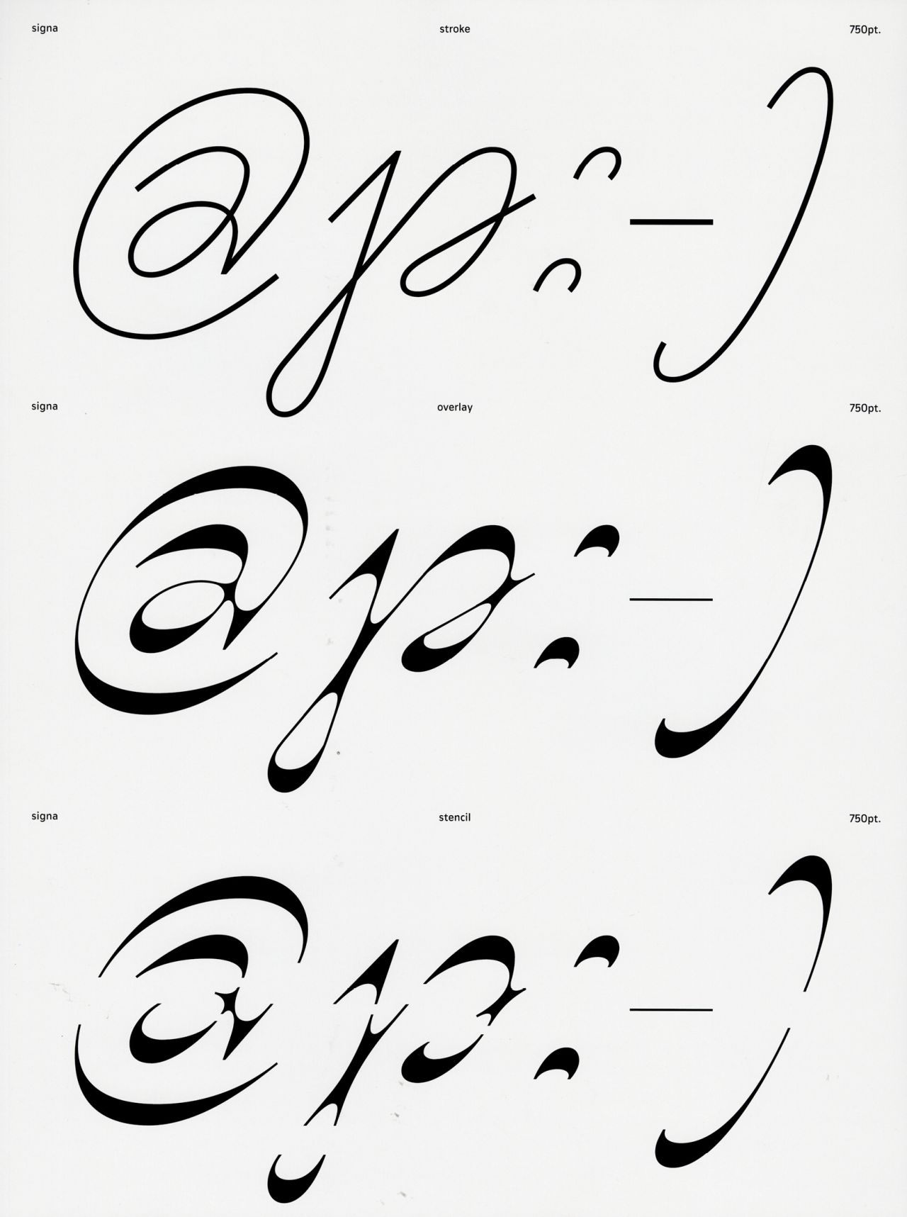
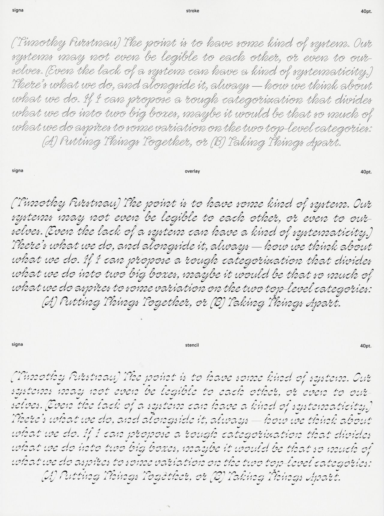
GLEAM stroke and stencil grew out of my personal drawing practice, exploring the space between letter and abstraction, standardisation and individuality. Two corresponding styles emerged from this process, each carrying a distinct logic: a stroke style, built through the search for the right construction, and a stencil style, defined by its approach to contrast. When layered together, the two reveal shifting relationships between form and counter form, continuity and break, pushing legibility while following the structural rules of script.
Type Design
initiated at Ecal MATD 22/24,
mentored by Alice Savoie
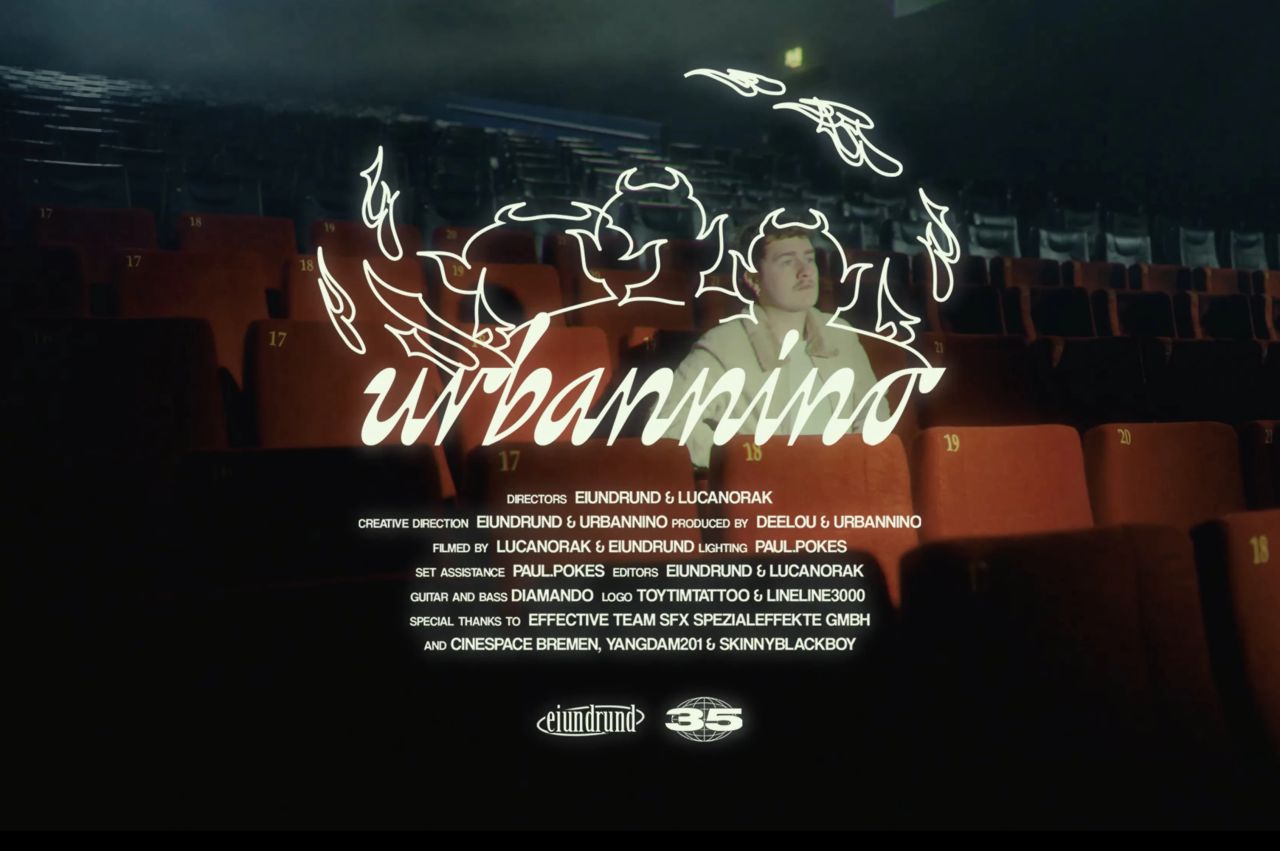
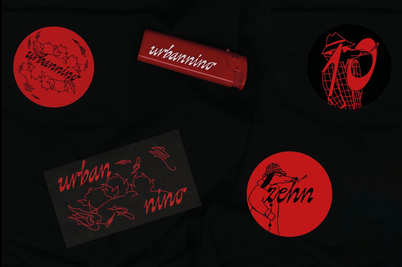
Various applications and a logotype for German indie artist URBANNINO, whose music explores love, heartbreak, and moments of ecstasy. Equally mischievous, and expressive, his persona is reflected in a logotype that balances fluid, dynamic forms with a mechanical yet playful energy.
Graphic Design, Branding, Custom Logotype
for Urbannino
Illustrations: Toytimtattoo, Seli Gurny
Video Stills: Julius Eirund
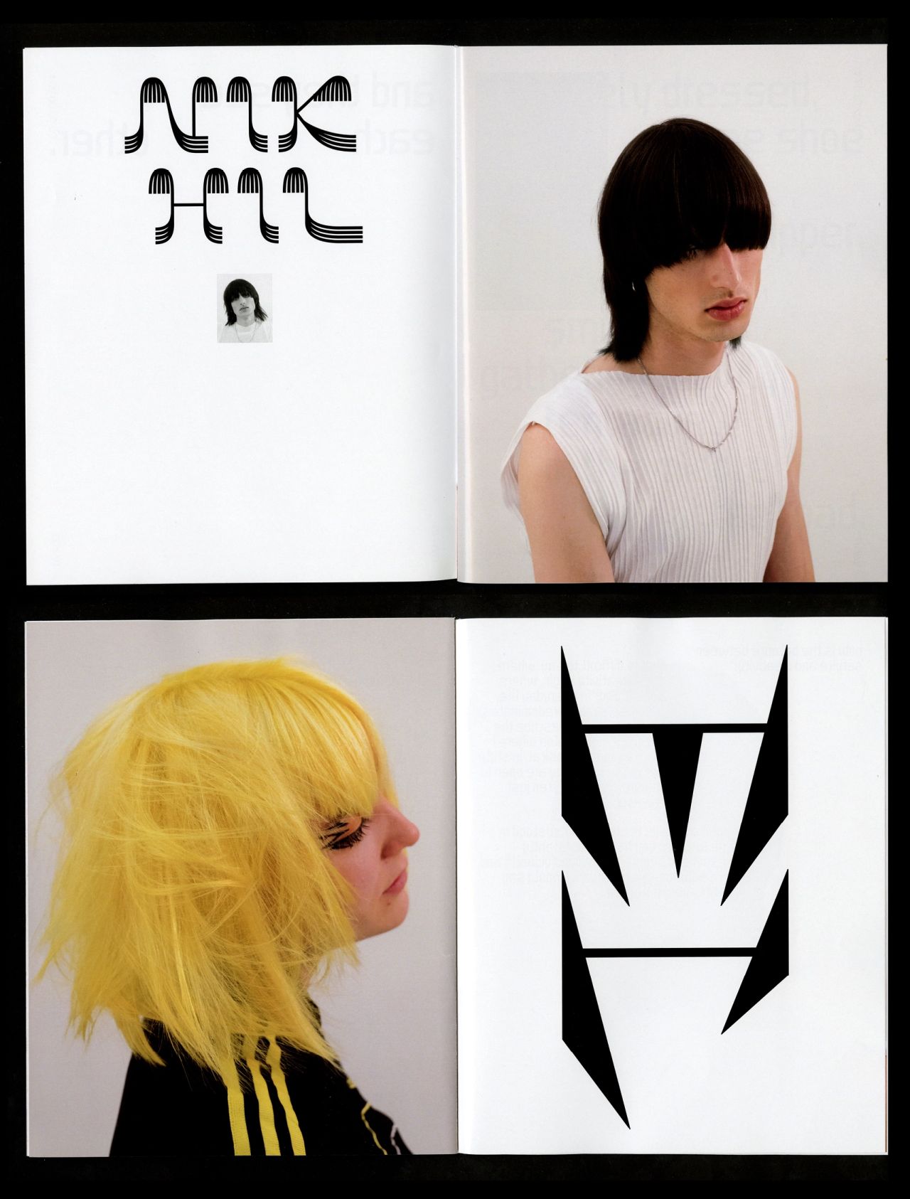
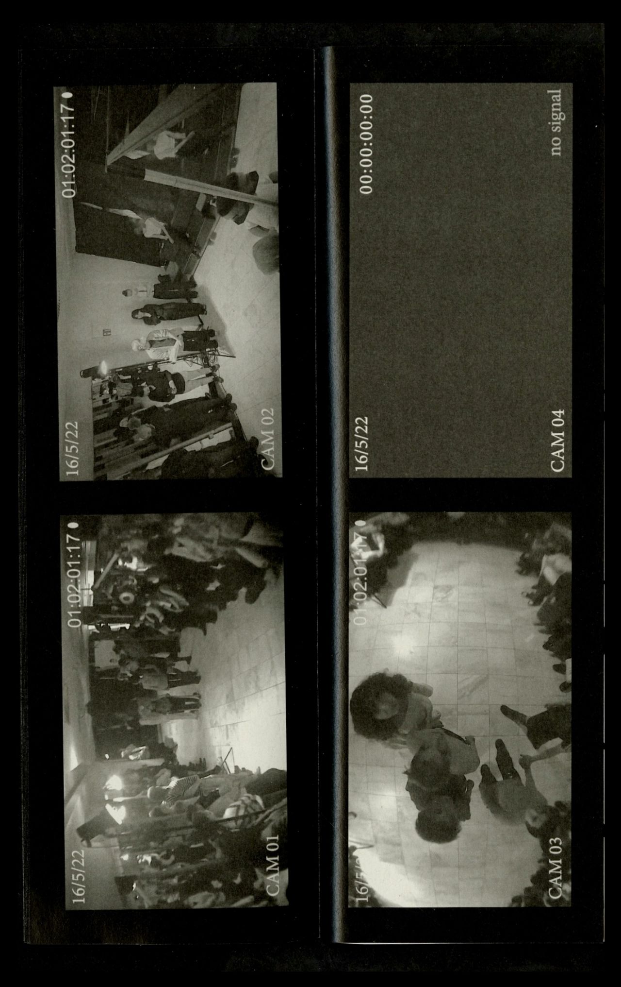
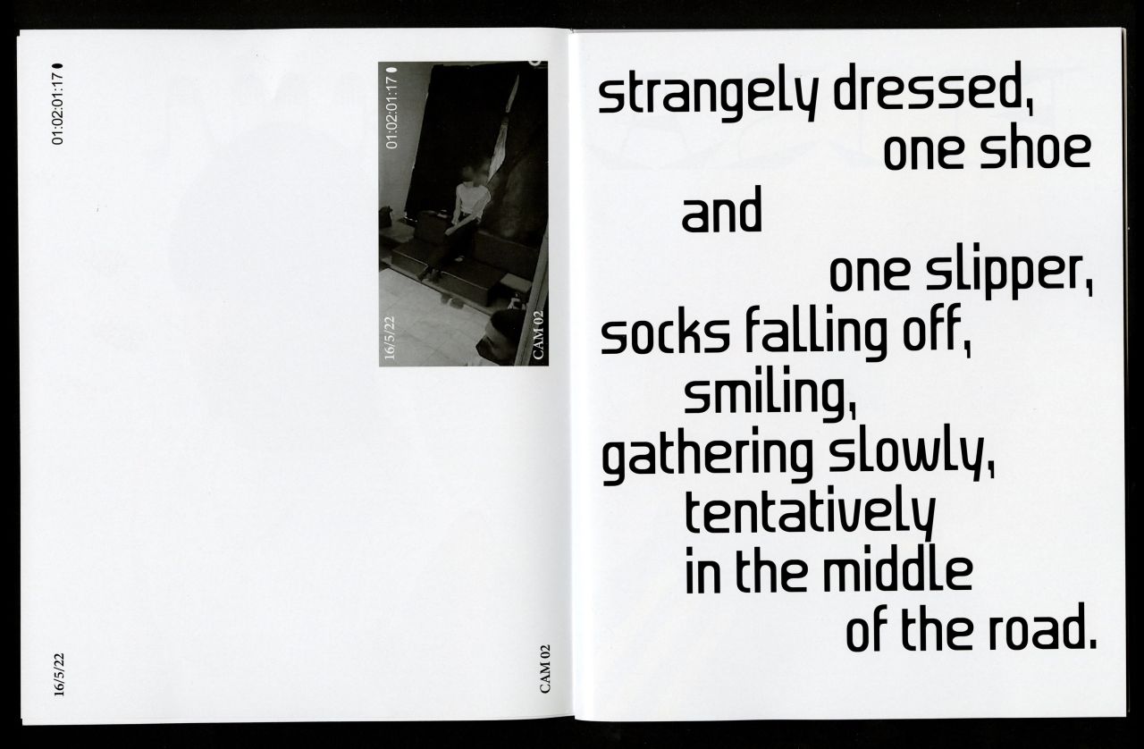
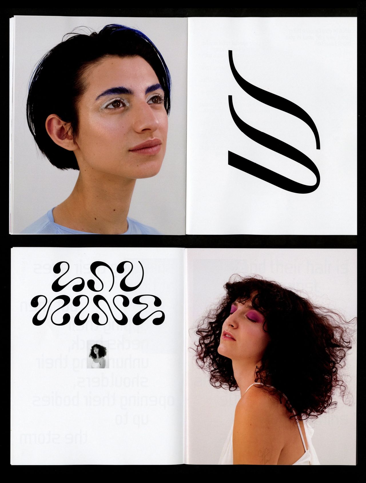
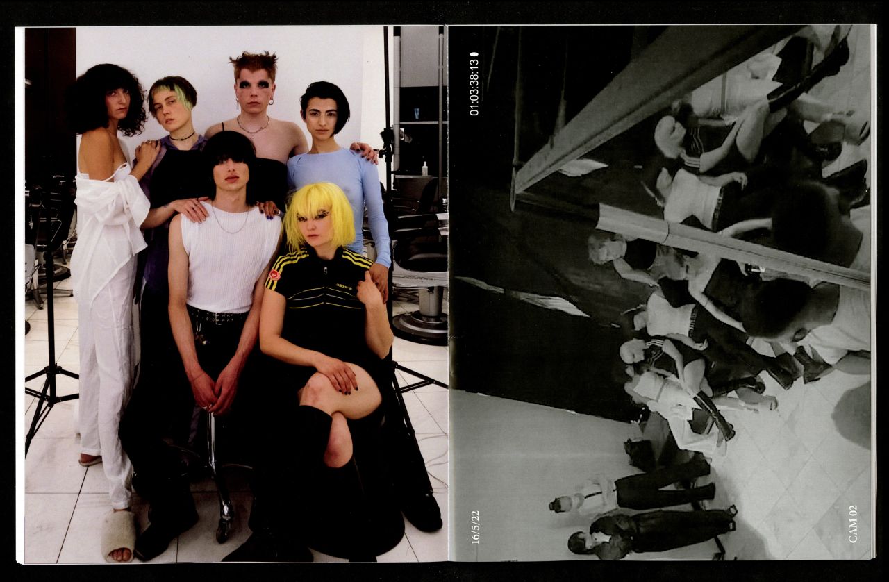
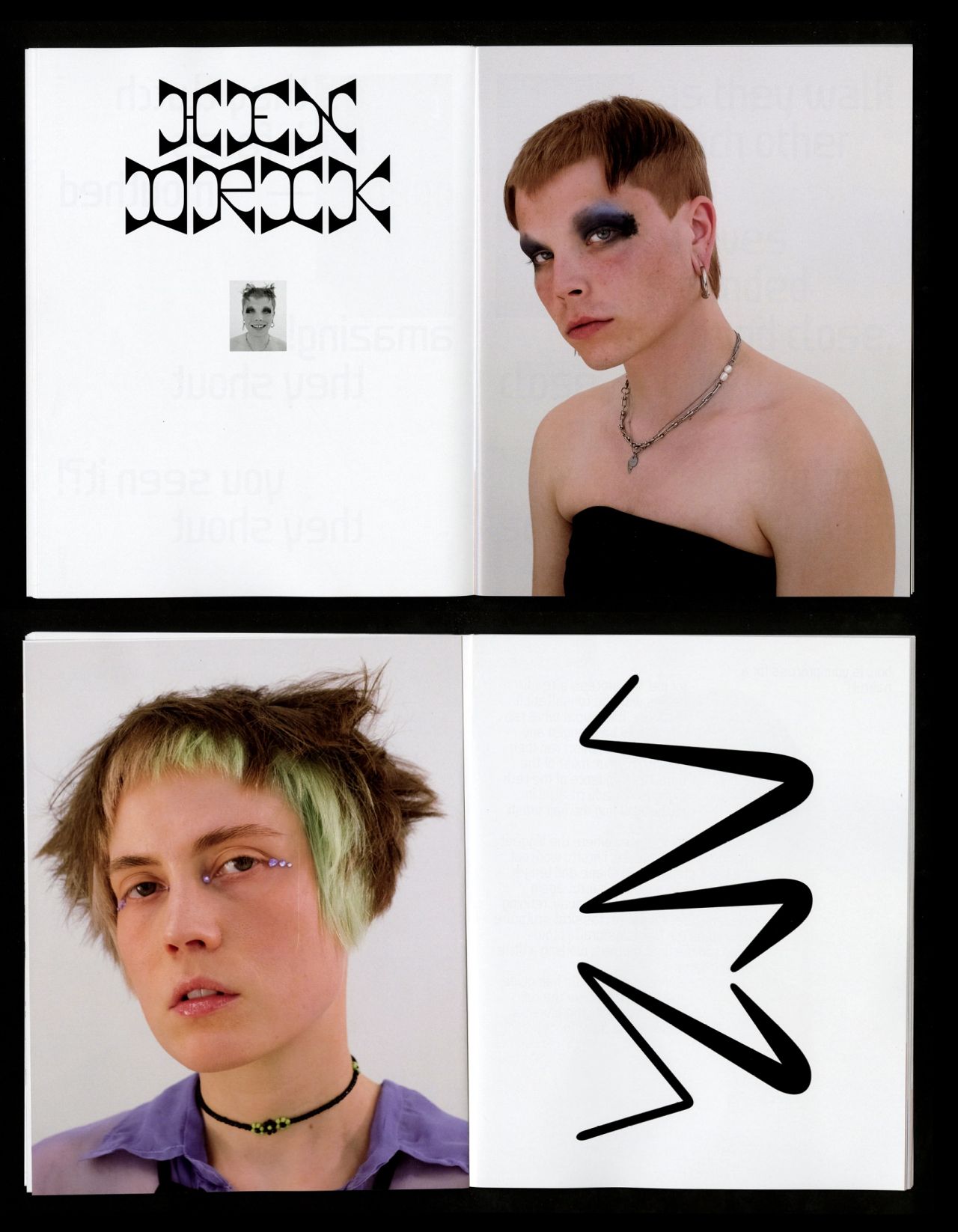
LET THEM EAT CHAOS presents the work of hairdresser Elisa Pürkner. Six haircuts, inspired by a poem by Kae Tempest, alongside a performance, highlight the idea of being strongly connected in the hopeless and sleepless surroundings of the night. Aiming to give Elisas work a new form and place to exist in, six letterings corresponding to each haircut were created — reflecting the shared practices of making shapes and taking care inherent to both our fields.
Editorial Design, Custom Lettering
200x250 mm, 84 pages
in collaboration with Elisa Pürkner
Photos: Fabian Schwarze
Performance Stills: Jonas Albrecht
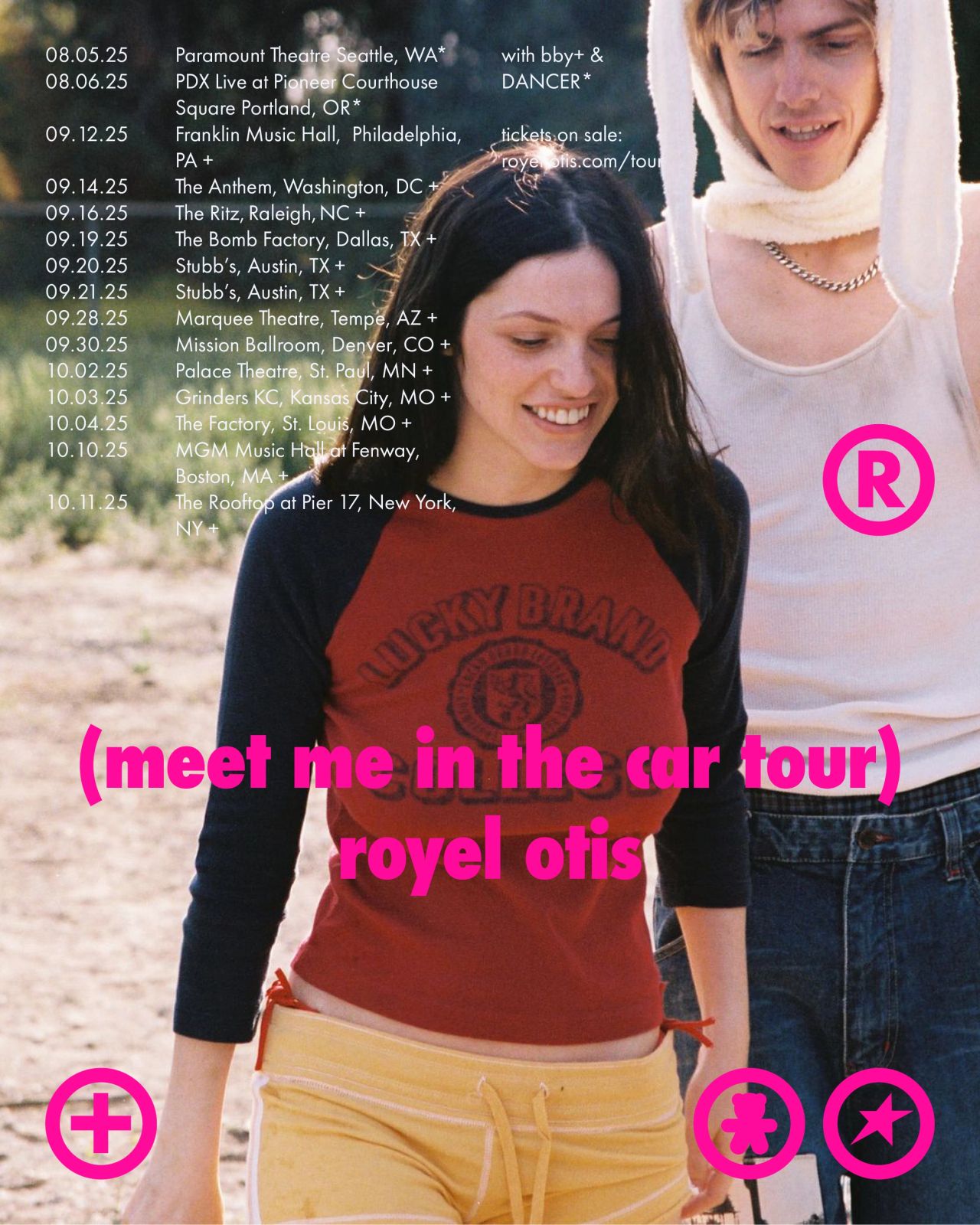
Visual material for the roll-out of HICKEY, the sophomore album by Royel Otis. Rooted in the here and now, the campaign showcases what it means to be in the moment, creating a visual world to embody and experience. Ever-flowing and effervescent, like first kisses and late-night adventures.
Content Design for Socials
for Royel Otis [ourness + Capitol Records]
Creative Direction: Adriana Neshoda
Photos: Zora Sicher
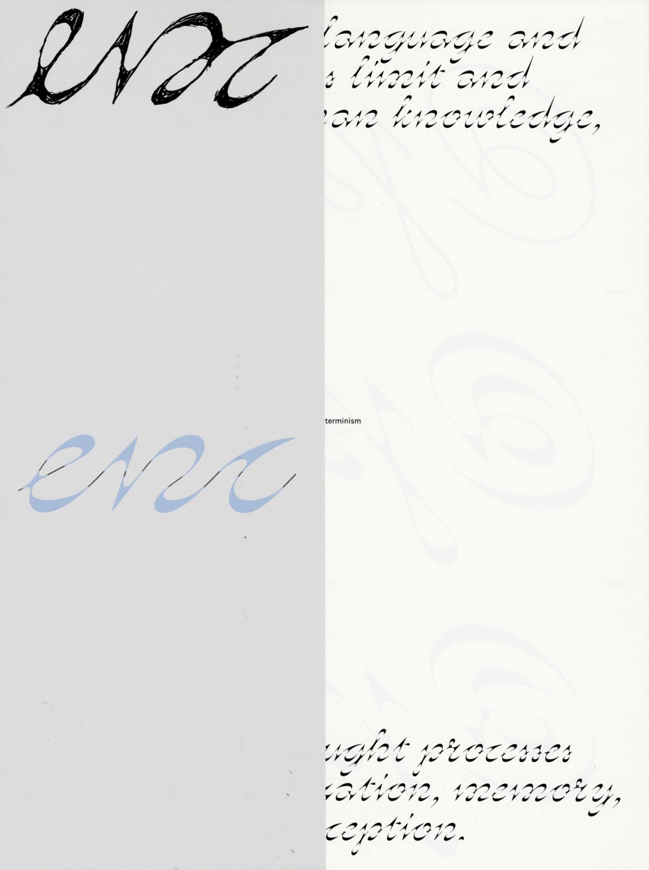
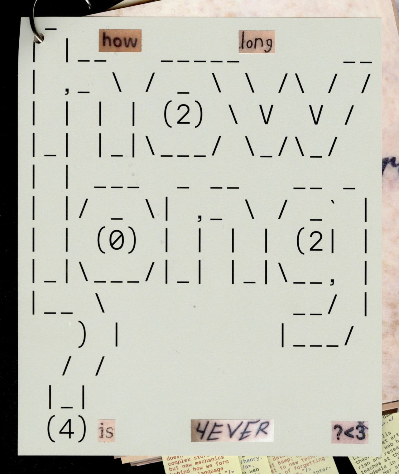
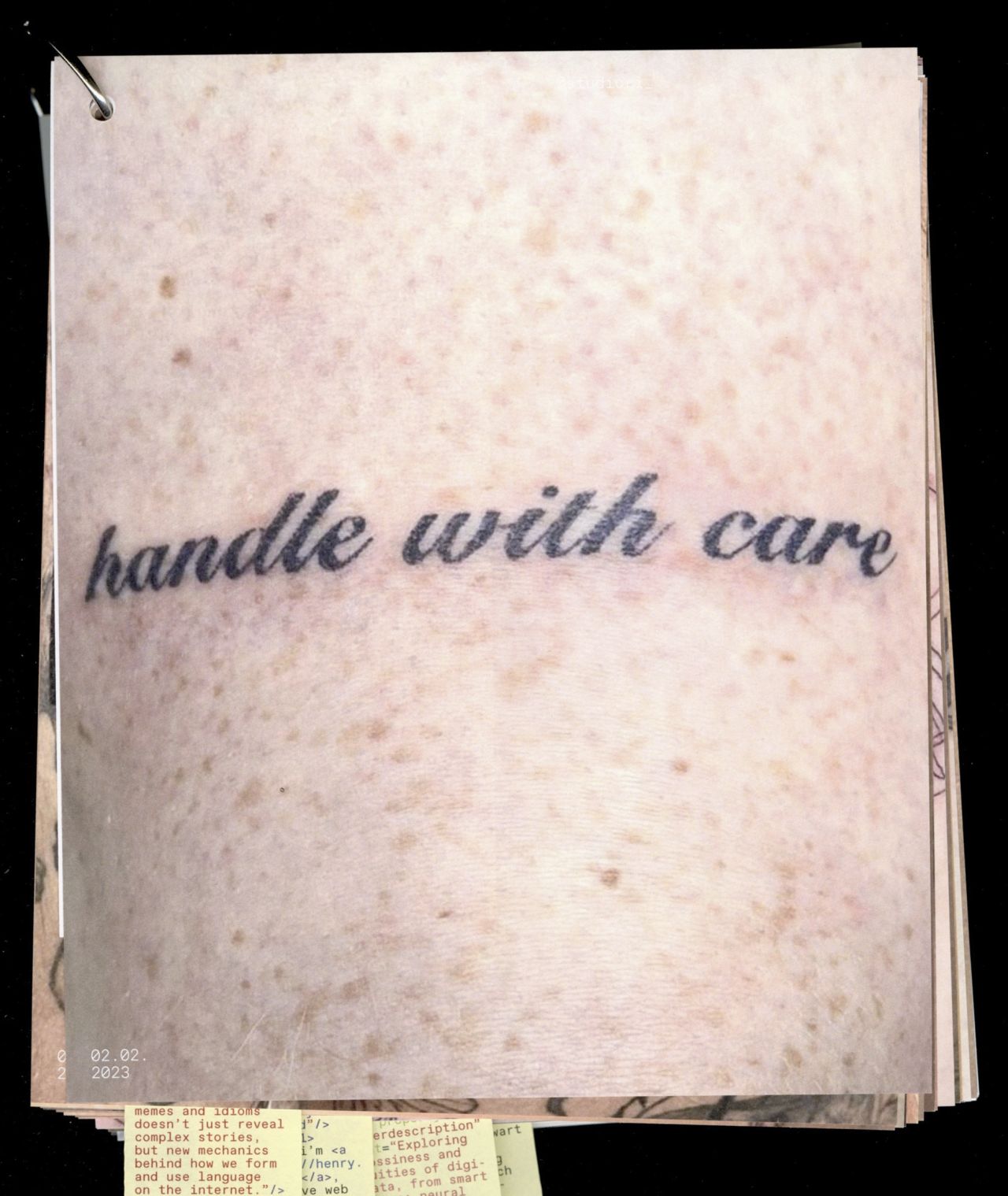
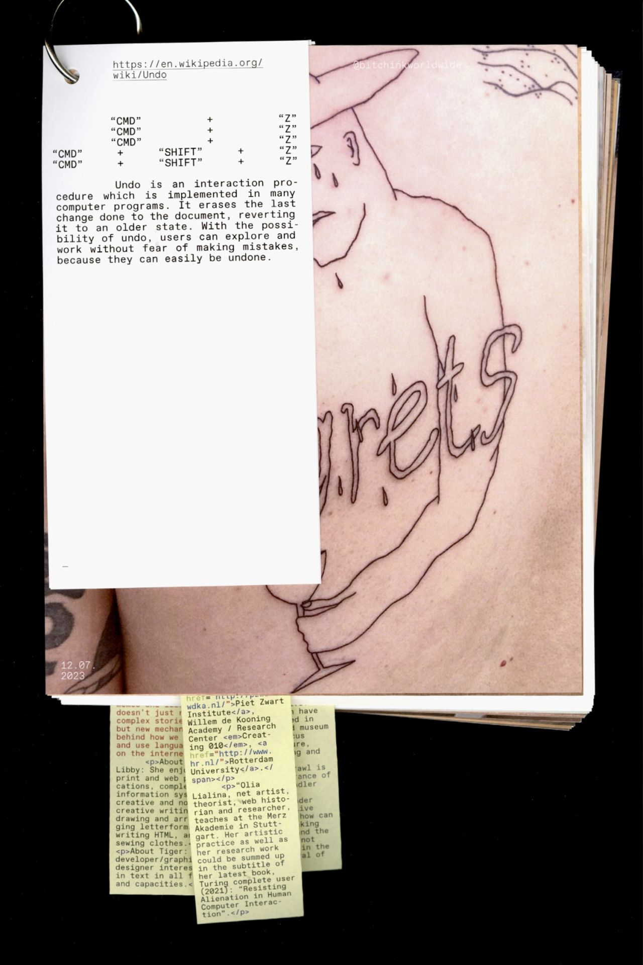
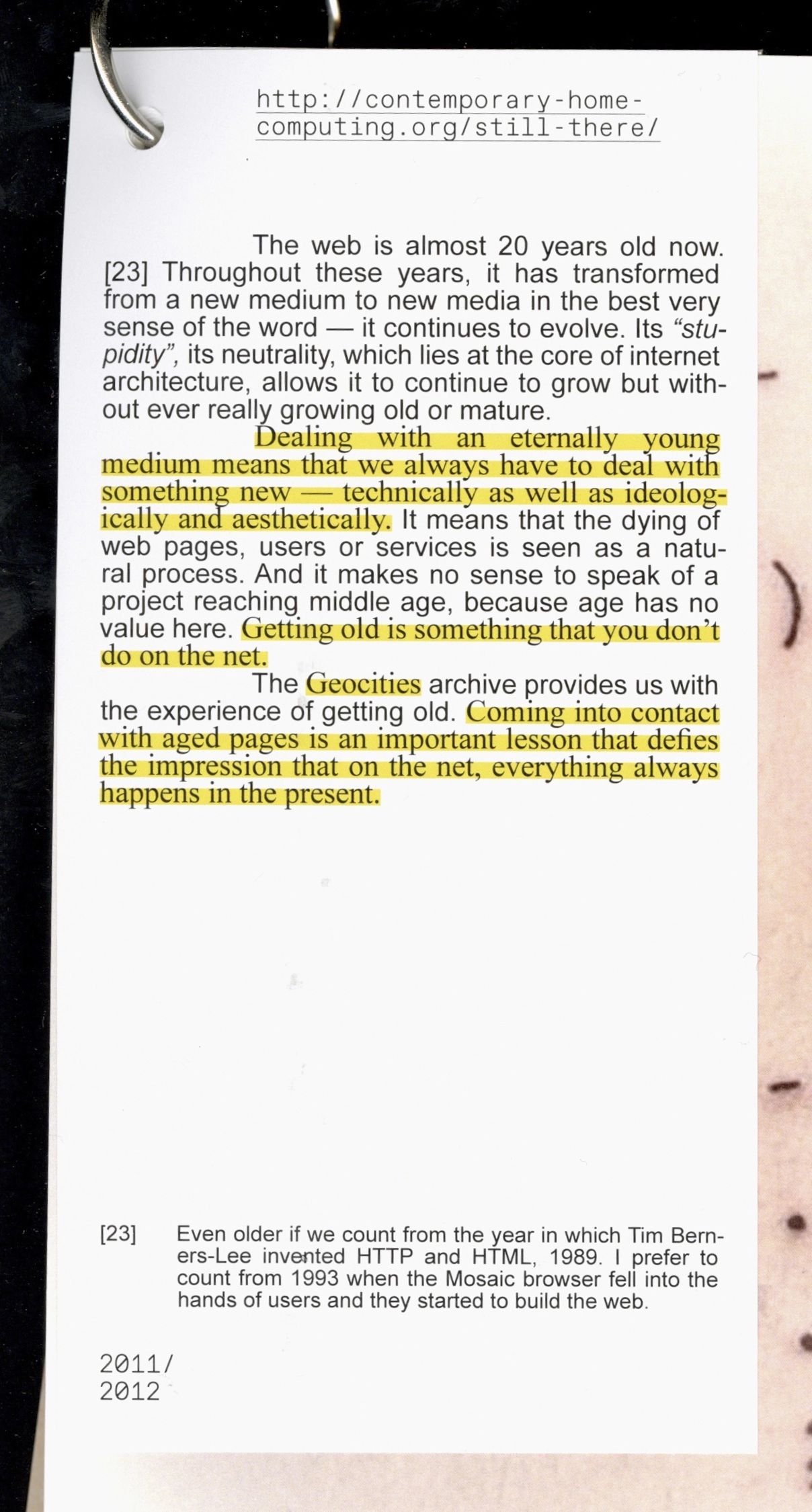
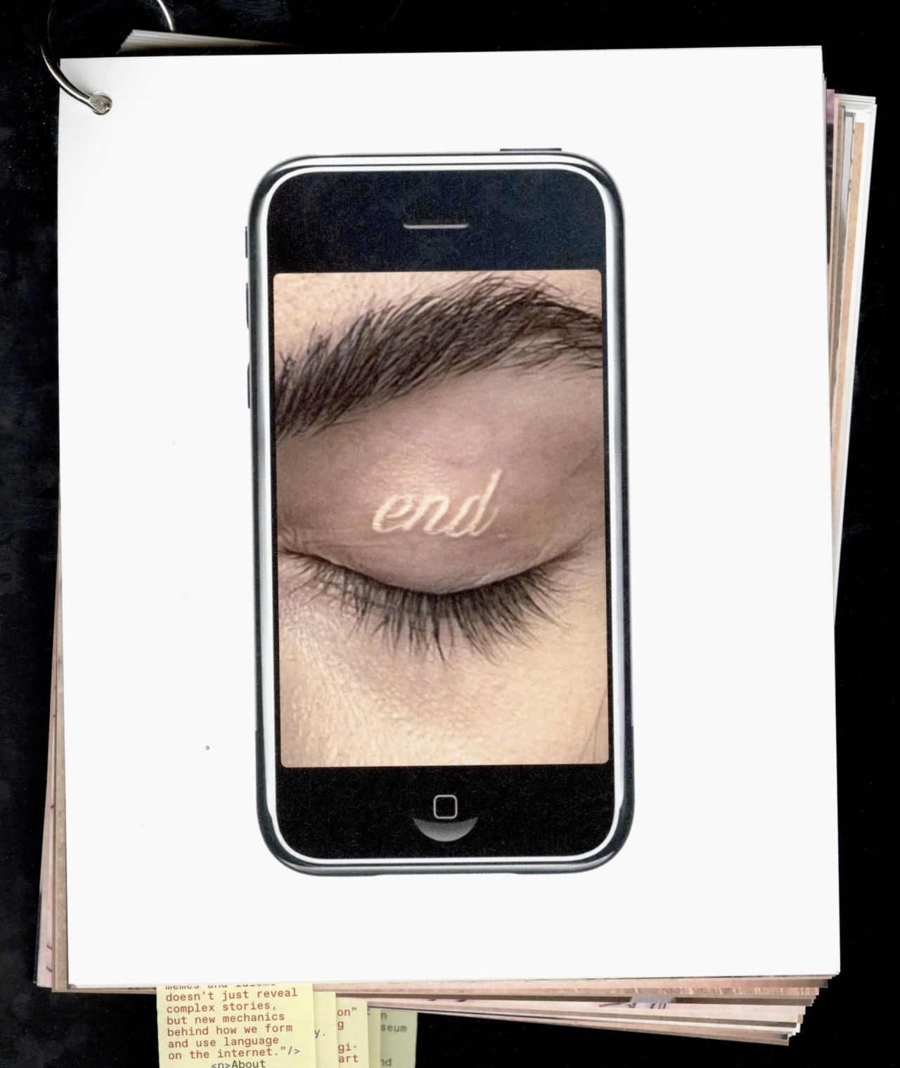
HOW LONG IS 4EVER? examines two mediums often thought of as eternal, exploring the ways they both experience loss and decay. Sequences of tattoo images converse with texts about the digital, and vice versa, creating a dialogue between skin and screen. Themes of the digital, the eternal, mortality, and aging unfold across these two distinct carriers of information, revealing unexpected, at times humorous connections within the publication.
Editorial Design
178,5x215mm, 95 pages
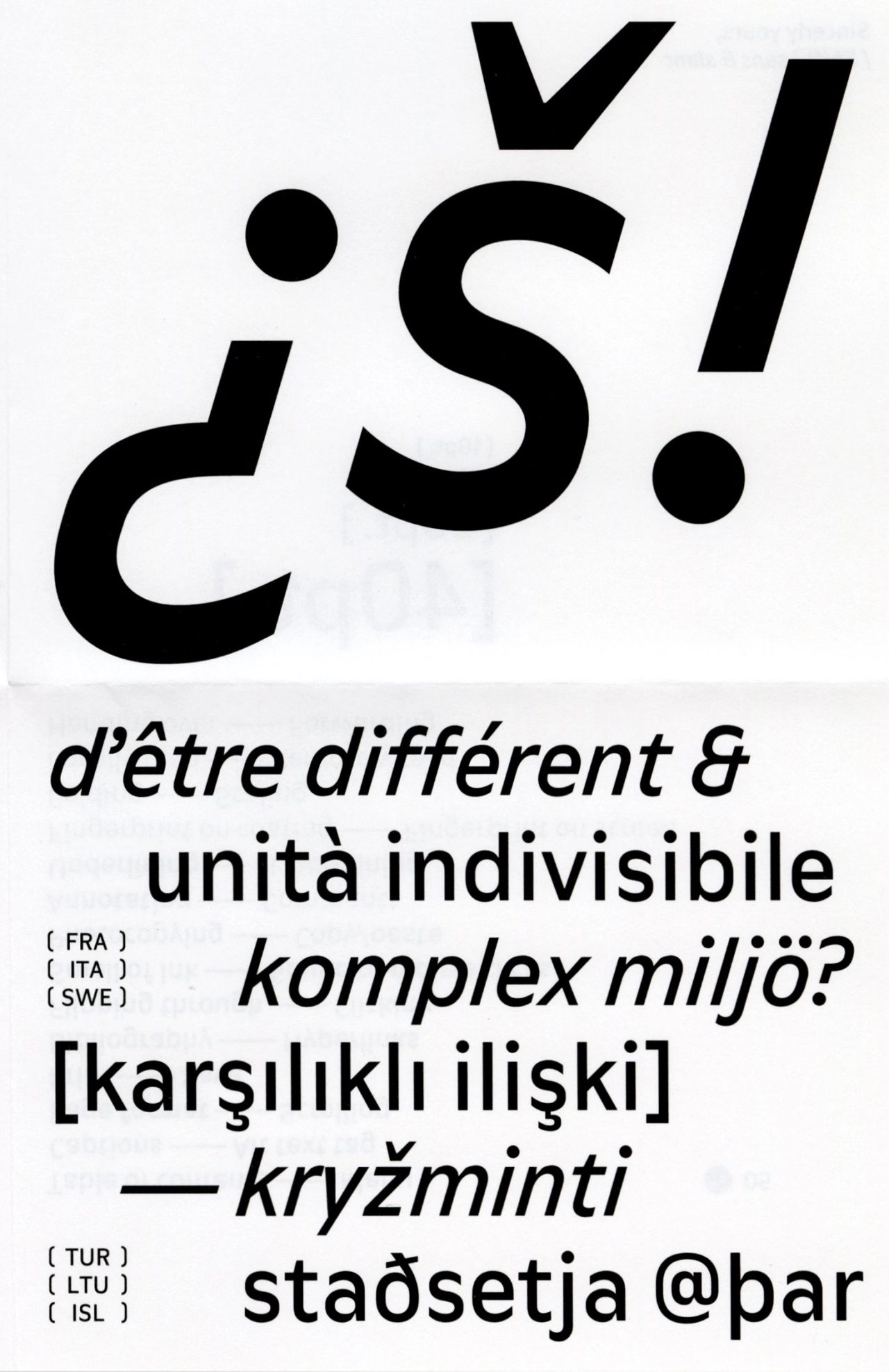
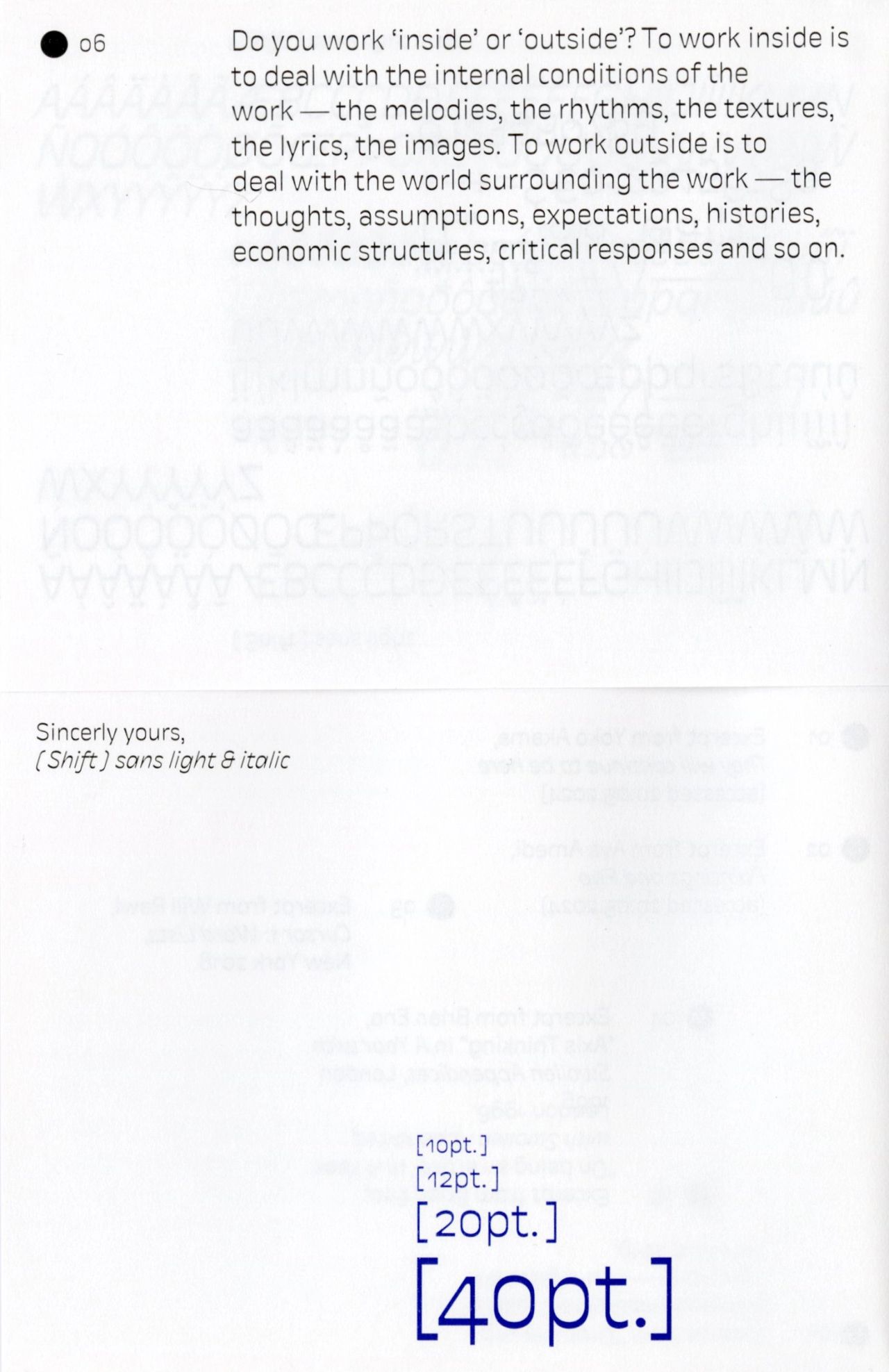
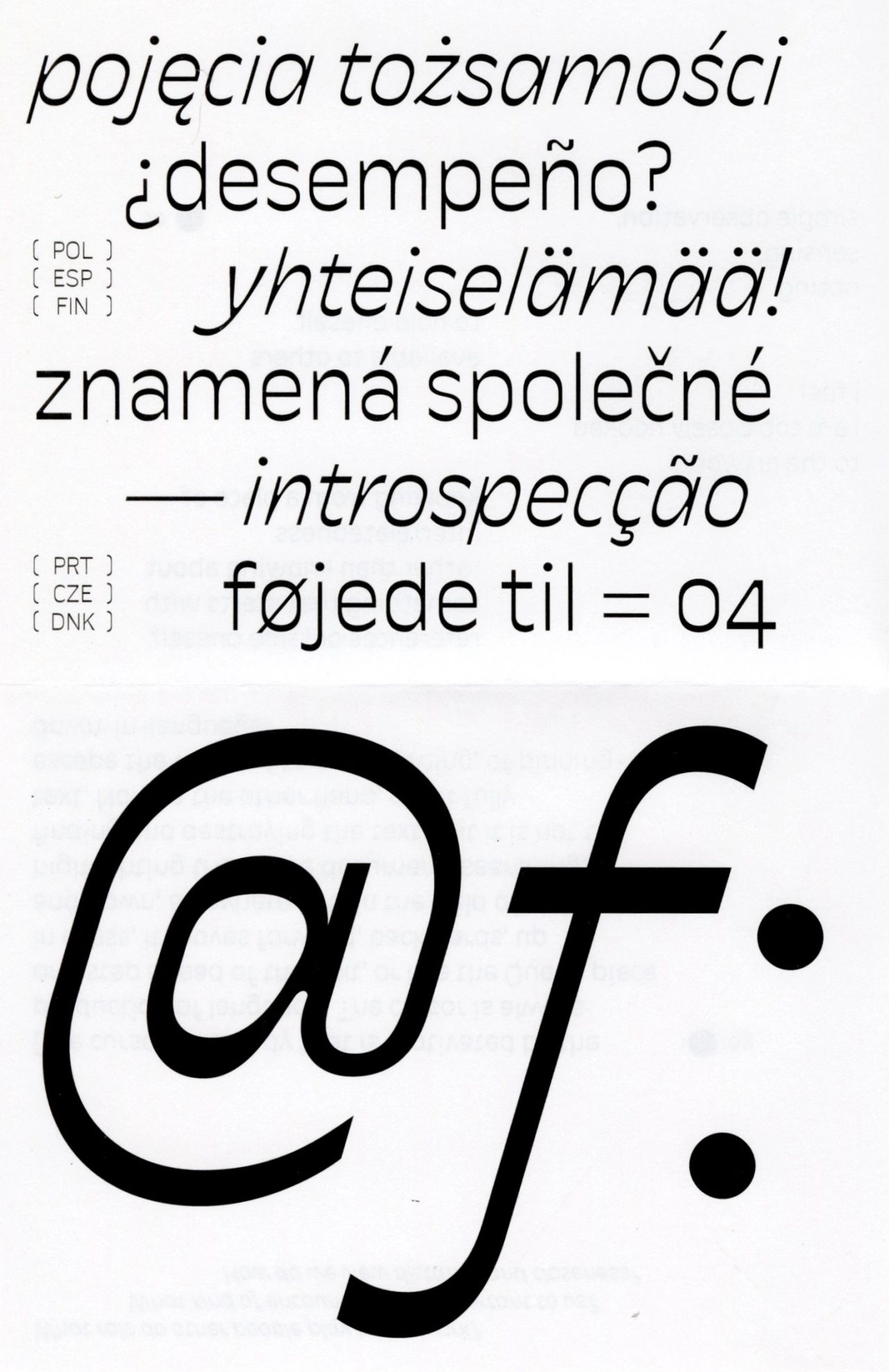
SHIFT is a family of four pairs of roman and italic, spanning sans to serif and medium to light weights. Rooted in the idea of voice and conversation, the typeface stages a dialogue between different typestyles — a play of distance and proximity, agreement and tension. The exchange between sans and serif places each in relation to the other, generating moments of variation and crossover in tone, construction, and proportion. Designed for text as well as larger settings, SHIFT reveals its character gradually, offering rhythm, contrast, and subtle shifts in expression.
Type Design
initiated at Ecal MATD 22/24
mentored by Kai Bernau, Radim Peško
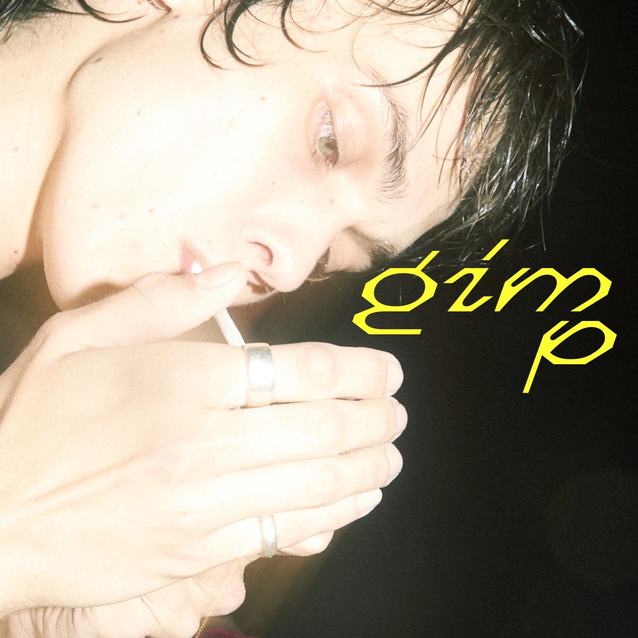
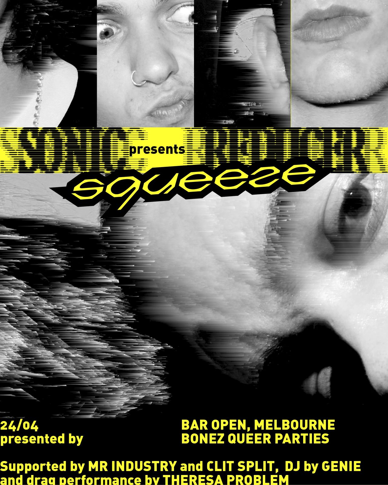
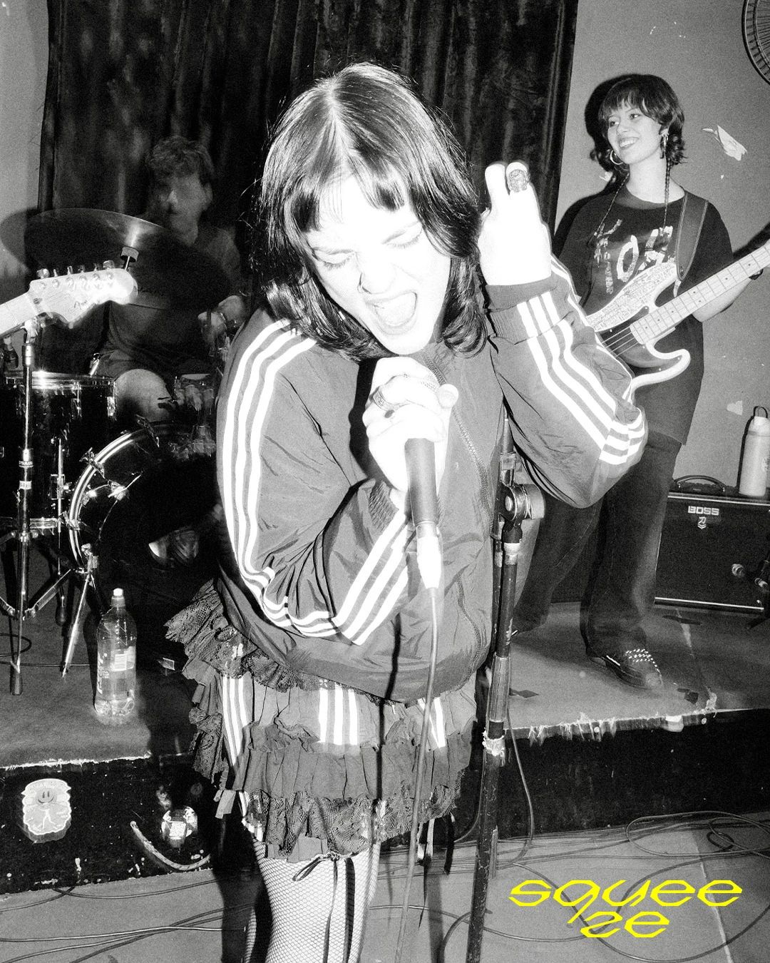
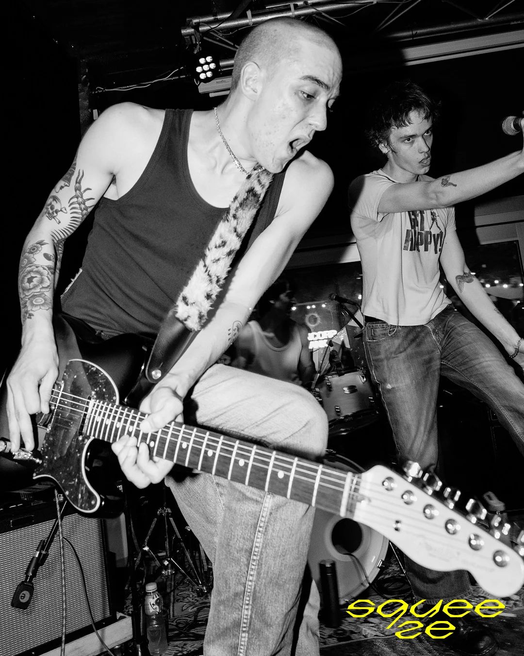
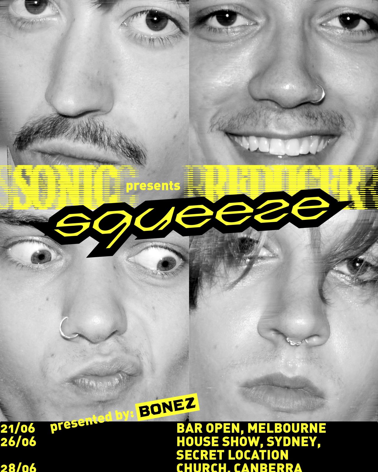
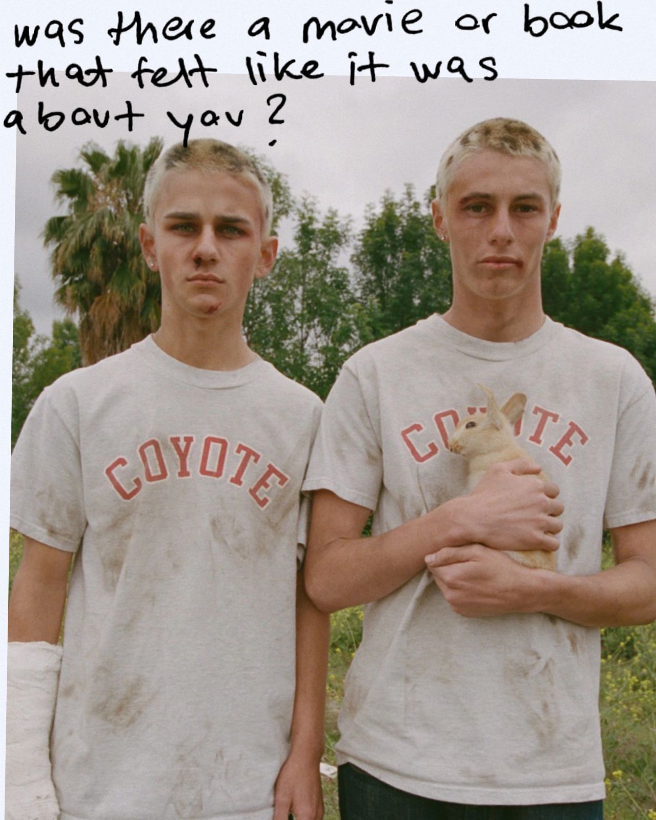
SONIC REDUCER's raw energy and immediacy — bold, urgent, and uncompromising — is reflected across all ephemera for their EP SQUEEZE. Custom type, art direction, and design aim to create rough-edged, honest visuals that reject surface-level polish while keeping a playful wink.
Art Direction, Graphic Design, Custom Type
for SONIC REDUCER [ourness]
Photos: Sam Armstrong, Charlie Foster, Zach Fegusson